|
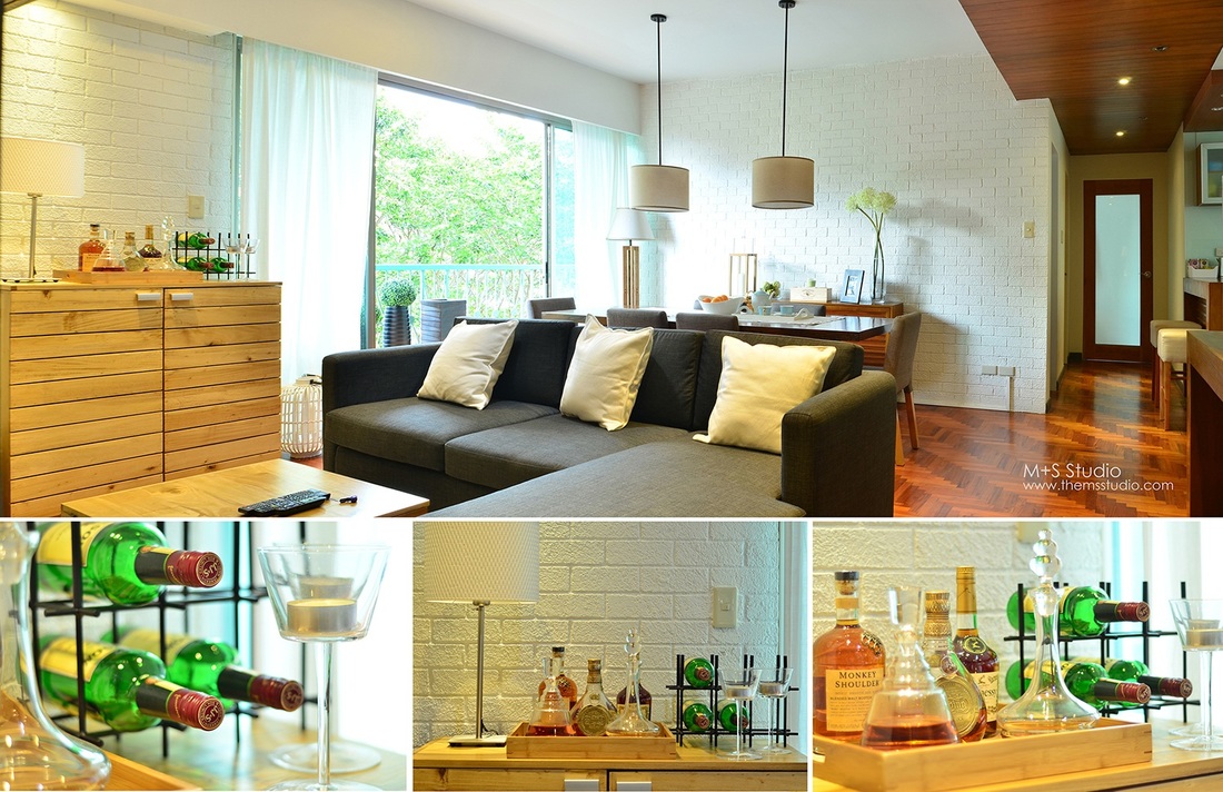
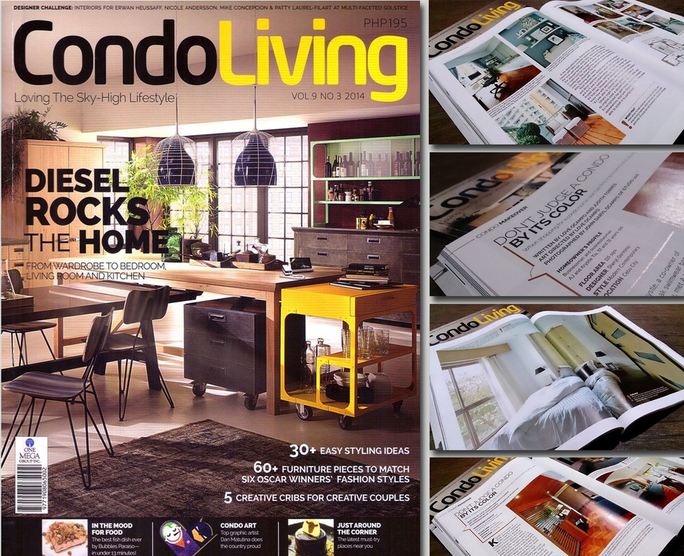
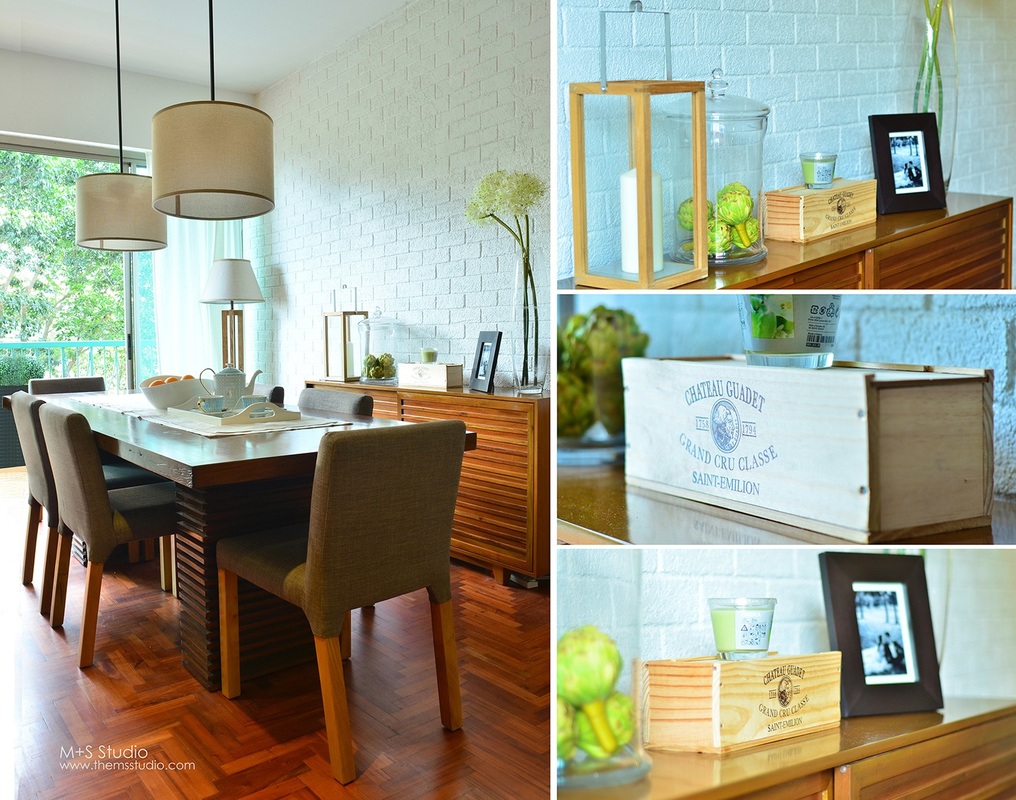
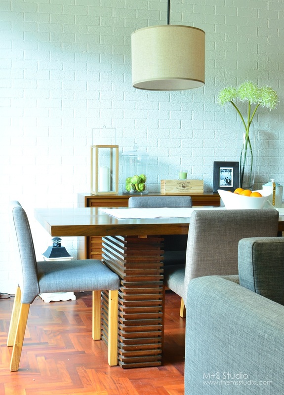
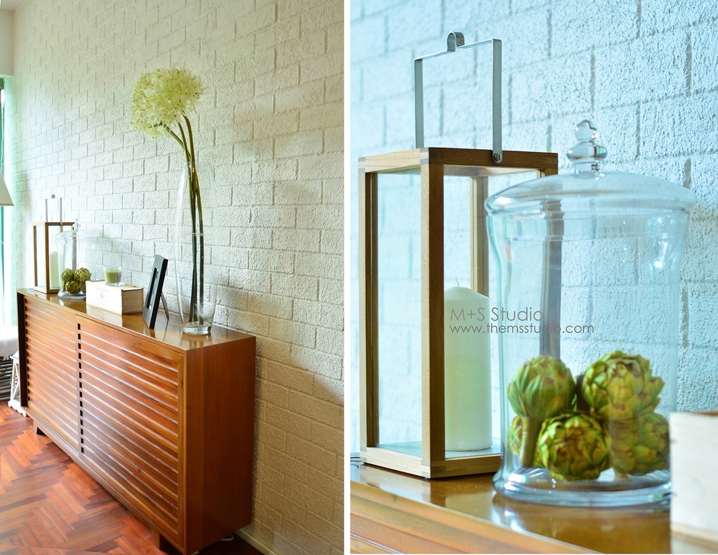
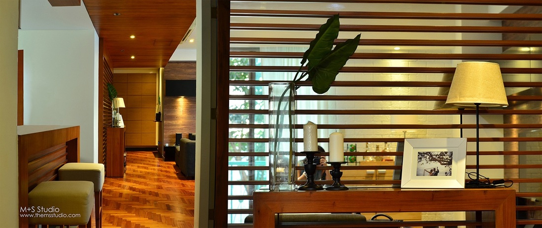
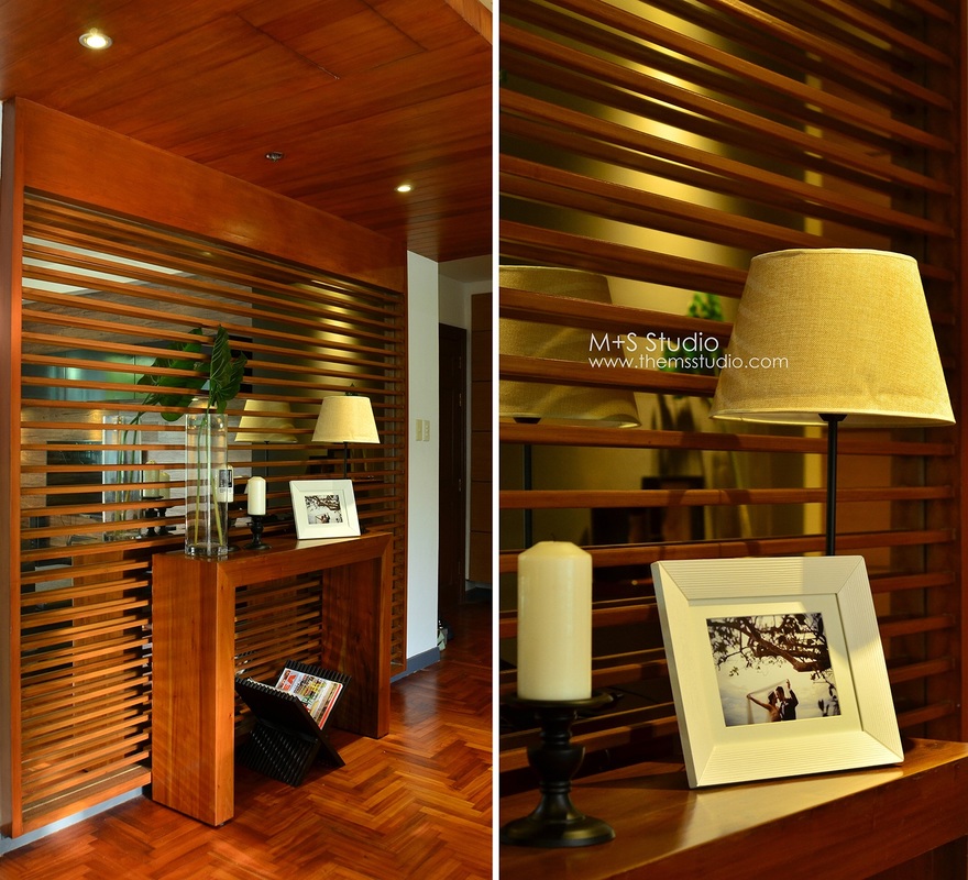
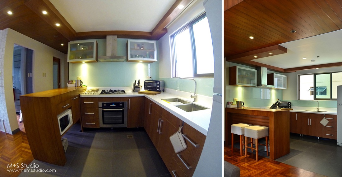
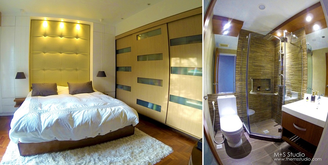
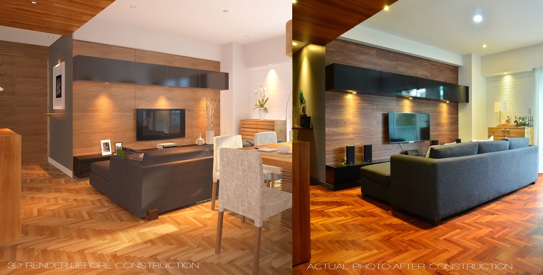
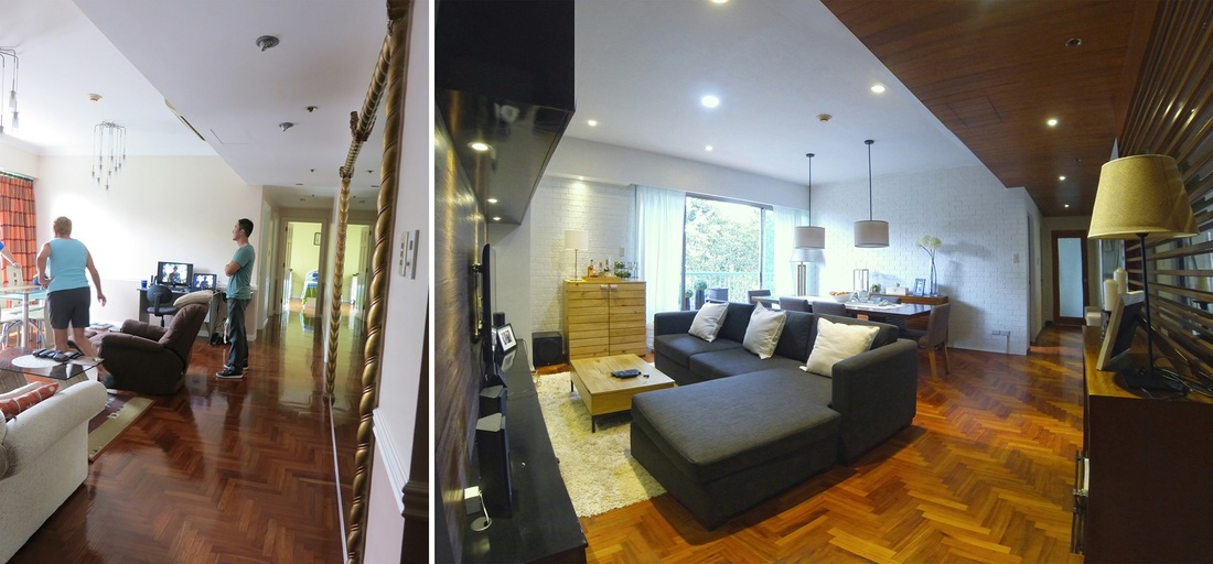
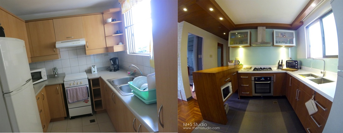
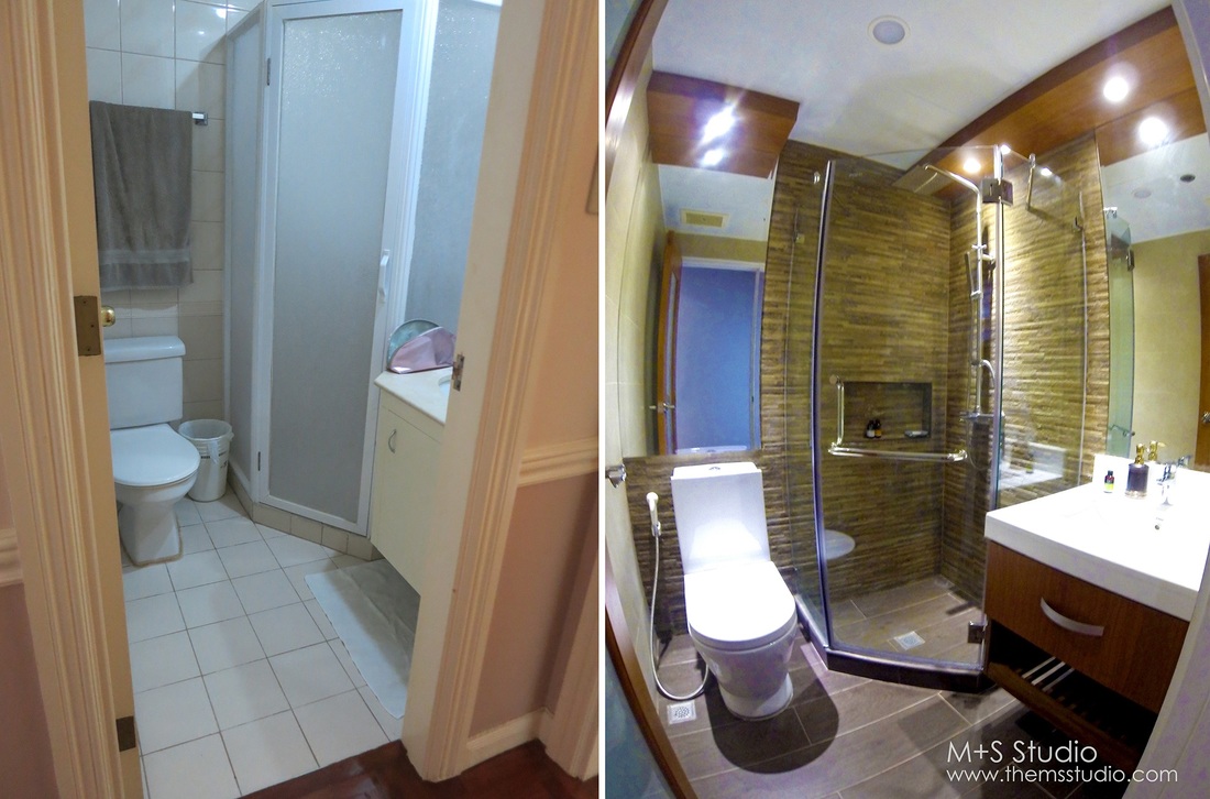
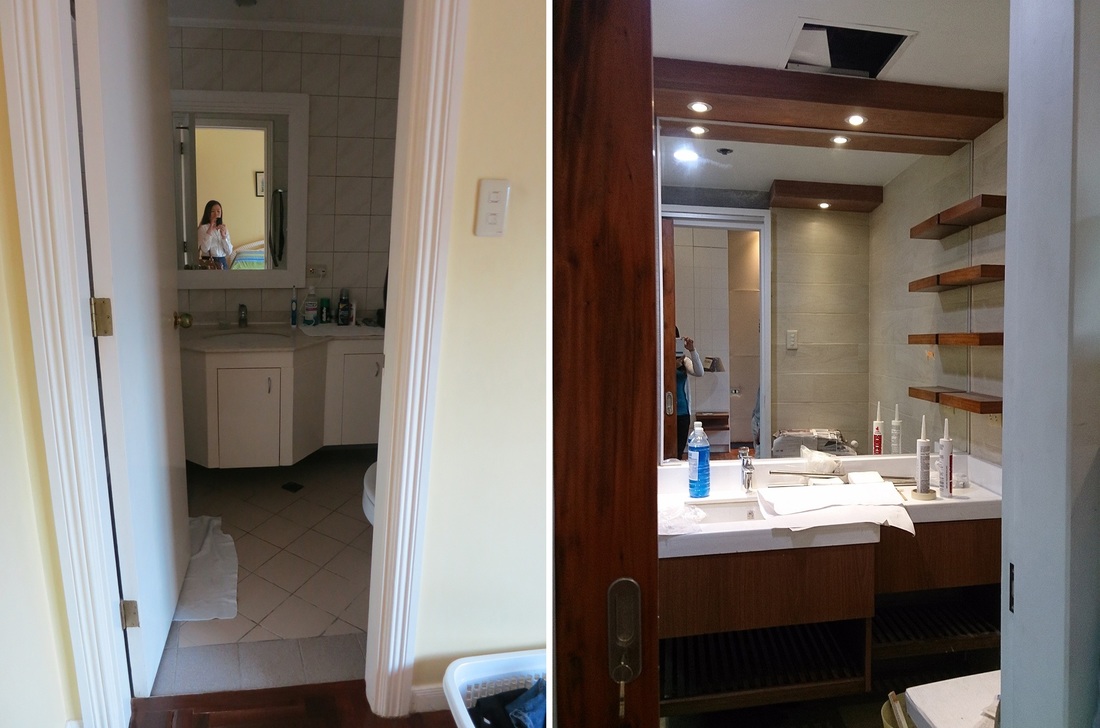
One of the most fulfilling projects we have done. We remodeled this two-bedroom unit in Citylights Garden Residences 2 years ago, with very keen eye for details, from floor to ceiling, and had broken up some walls to open up spaces. This was featured in one of CondoLiving Magazine's 2014 issues (vol.9 no.3) below, pages 62-69. The client had several requirements, and one of the challenges we had was how to combine what they want into a harmonious and holistic design. But in the end, glad we were able to pull it off. The photo above is the dining area. Since we could hardly find some ready-made pieces that we want in Cebu, we just had almost all of their furniture pieces custom-made by a local furniture maker. The dining table is made of solid mahogany wood and made to look distressed or antique, which adds a little bit of rustic touch to the interiors. We trimmed this sideboard's depth for it to fit the area, which we also did for the other furniture pieces, to give enough room to move around. The brick pattern on the wall, was just plastered and stamped, up to a certain thickness to avoid taking up space compared to applying the real one. The photo at the left (above) is the kitchen, which used to be enclosed with a wall. The far end, with the brown wood, may appear to be just an accent wall in wood finish, but it's actually a shoe rack, from floor all the way up, from a very small space that we were able to utilize. And this big mirror here on the wall, was the already existing (before the renovation), and this is the one thing that the client's father requested to never take out due to some sentimental value, and in the way this large mirror was brought and installed to this unit. So what we did was to incorporate it in the design and voila! This is the kitchen. The side with the nook was supposed to be a wall. It was a great thing that we opened it up because it created a better cross ventilation. Above is the masters bedroom (left), and the right photo is the common bathroom. There is actually a beam above the bed's headboard, and our treatment to it was to add a storage cabinet at both sides of the bed to flush the beam. Above is the entertainment area, one with the living room. The left photo was the artist's rendering on the design proposal, while the right photo is already the actual photo after the design was implemented. Just sharing on how the team can get quite OC on the details. On the following photos below, we're going to show some before and after photos of the old to new look. The living room/entertainment area before (left photo), then after (right photo). The old hallways and living room (left) and the new one (right) The kitchen before (left) and after (right). The guestroom before (left) and after (right). The common bathroom before (left) and after (right). Masters bathroom before (left) and after (right). And finally, the masters bedroom before (left) and after (right).
1 Comment
|
DESIGN PORTFOLIOA photo blog on our Architectural and Interior Design projects PROJECTS
All
Archives
June 2015
|
